Introduction: How to Build an Excel Dashboard: Step-by-Step Guide
Tracking business performance should not require expensive software or a data science team. A well-built KPI dashboard in Excel gives managers and business owners a clear, real-time view of what matters most, from revenue and conversion rates to operational metrics. In this step-by-step tutorial, you will learn exactly how to build an Excel Dashboard for KPI monitoring, even if you are not an advanced Excel user. By the end, you will have a practical framework you can adapt to your own business context.
What Is a KPI Dashboard and Why Does It Matter?
A KPI (Key Performance Indicator) dashboard is a visual summary of your most important business metrics in one place.
Instead of opening five different reports to check how the business is performing, a well-structured dashboard gives you that overview at a glance.
For small and medium-sized businesses, Excel remains one of the most accessible and powerful tools to build this kind of view. Furthermore, when you build an Excel dashboard from scratch, you control exactly which metrics appear, how they are calculated, and how they are presented to your team. This flexibility is a significant advantage over rigid, pre-packaged reporting tools.
Step 1 – Define Your KPIs Before Opening Excel
The most common mistake in dashboard building is jumping into Excel before deciding what to measure. Consequently, you end up with a spreadsheet full of data but no clear story.
Start by listing your top 5 to 8 KPIs. These should be measurable, directly tied to business goals, and updated regularly. Common examples include:
- Monthly Revenue vs. Target
- Customer Acquisition Cost (CAC)
- Conversion Rate (leads to customers)
- Net Promoter Score (NPS)
- Average Ticket Size
- Monthly Active Users or Clients
Once you have your list, decide on the time frame: daily, weekly, or monthly updates. This decision shapes how you structure your raw data sheet, which is the foundation of everything that follows.
Step 2 – Organize Your Raw Data Sheet
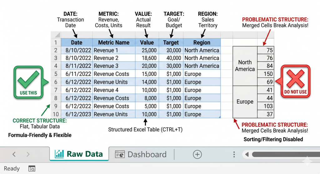
Before building any chart, your data needs a clean, structured table. Open Excel and create a dedicated tab called “Raw Data.” This tab should never contain formulas that pull from other sheets at this stage. Instead, it is your input source.
Structure your table with headers in Row 1. For example: Date, Metric Name, Value, Target, Region. Each row below represents one data entry for one period. Keep the formatting consistent: dates in a date format, numbers without text mixed in.
Additionally, avoid merged cells in your data table entirely. They break many Excel formulas and make automation far more difficult later.
Simple, flat tables with one value per cell are always the right approach here.
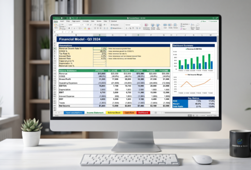
Step 3 – Build Your Summary Tab with Formulas
Next, create a second tab called “Summary.” This is where your formulas will pull from the Raw Data tab and calculate the values your dashboard will display.
Use SUMIF or SUMIFS to aggregate values by category or date range. For example, to sum all revenue values for a specific month, you would use a formula like:
=SUMIFS(RawData[Value], RawData[Metric Name], “Revenue”, RawData[Date], “>=”&StartDate, RawData[Date], “<=”&EndDate)
Also, define named ranges for your date filters. This makes formulas easier to read and allows your dashboard to become interactive through dropdown menus later. Moreover, using Excel Tables (Ctrl+T on your raw data) lets your formulas expand automatically as new data is added, which is essential for long-term maintenance.
Step 4 – Design Your Dashboard Tab
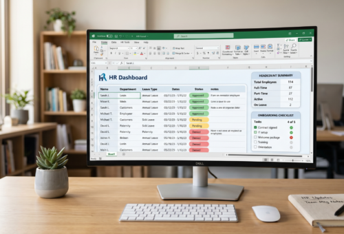
Now comes the visual layer. Create a third tab called “Dashboard.” This is the only sheet your final audience needs to see.
Start by turning off gridlines for this tab: go to View and uncheck Gridlines. This immediately gives the sheet a cleaner, report-like appearance. Then use shapes and cell formatting to create KPI cards at the top. Each card should display a metric name, the current value, the target, and a simple status indicator such as a colored dot or an arrow symbol.
Below the KPI cards, insert your charts. Right-click on a chart area, choose “Select Data,” and point to your Summary tab values, not directly to Raw Data. This keeps your charts clean and easy to update. For KPI dashboards, bar charts for comparisons, line charts for trends, and donut charts for proportions work best together.
Finally, use conditional formatting on your KPI cards to automatically turn a value green when it meets the target and red when it falls short. This simple addition makes the dashboard genuinely actionable at a glance.
Check the full Microsoft official guide to Excel charts and dashboards
Step 5 – Add Interactivity with Slicers or Dropdowns
A static dashboard quickly becomes outdated. Therefore, adding at least one interactive filter transforms your file from a snapshot into a live reporting tool.
The simplest approach is a Data Validation dropdown in a cell linked to a named range of options such as month names or region names. Your Summary formulas then reference that cell as a filter variable. When the user changes the dropdown selection, all values and charts update automatically.
Slicers work similarly but look more polished. They are especially effective when your raw data is structured as an Excel Table and your charts are built from a PivotTable. For users who share dashboards with non-technical teams, slicers are often the better choice because they require no instruction to use.
Source
According to Microsoft’s Excel support documentation, PivotTables and connected slicers remain among the most widely used tools for business data summarization, enabling users to filter and analyze large datasets without writing complex formulas.
Source: Microsoft Excel Support
Conclusion
Building a KPI dashboard in Excel is completely achievable without advanced technical skills if you follow a clear structure: clean raw data, calculated summaries, and a well-designed visual layer. Each step builds directly on the previous one, so skipping any of them creates problems down the line.
That said, as your business grows, dashboards become more complex. Data sources multiply, formulas become harder to maintain, and performance can slow down significantly. At that point, the right move is working with Excel specialists who know how to build an Excel dashboard quickly and properly with the architecture and automation your operation actually needs.
The team at Sapphire Business Technology has helped over 2,000 clients across build Excel solutions that go far beyond basic dashboards, from fully automated reporting systems to integrated Power BI environments. If your spreadsheets are starting to feel like a limitation rather than a tool, we can change that.
Content created by Sapphire Business Technology, based on our expertise serving over 2,000 satisfied clients in Excel automation, custom spreadsheet development, and business intelligence solutions.